

A premium B2B website isn't about making things look expensive.
It’s about making every detail feel intentional.
The difference can be subtle. Two websites can use similar imagery, typography, colours and layouts, yet one feels considered and credible while the other feels generic or unfinished.
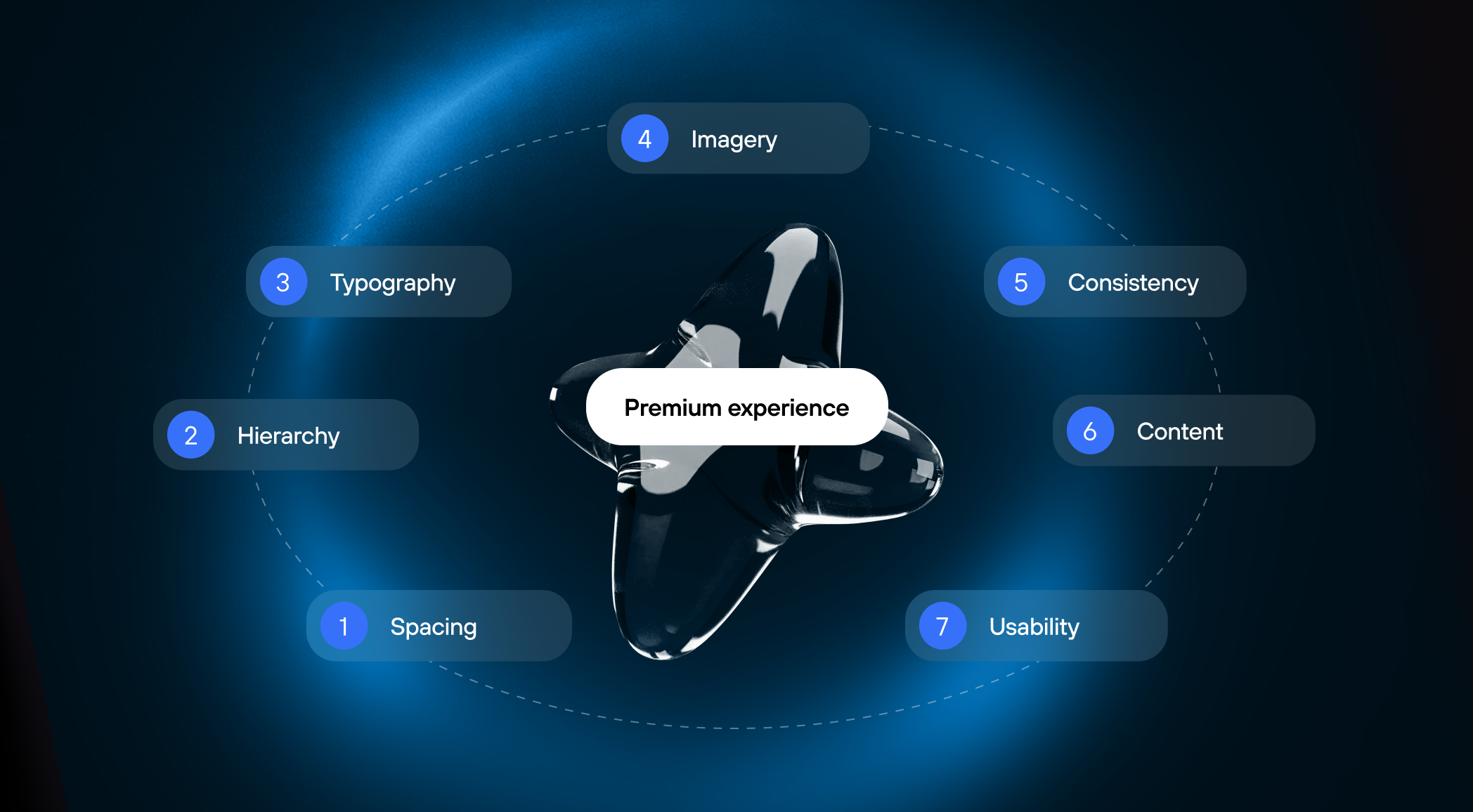
That perception doesn't come from a single design decision. It comes from how everything works together — typography, hierarchy, spacing, imagery, consistency, content and usability.
In B2B, this matters even more. Your website is often one of the first places a potential customer encounters your company. Before they speak to sales, read a proposal or see a product in action, the website is already shaping their perception of the business.
So what makes a B2B website feel premium?
A common misconception is that premium web design means adding more: larger visuals, more sophisticated animations, expensive-looking photography, unusual typography or complex interactions.
Usually, it means the opposite.
Premium design is often about knowing what not to add.
Every element has a reason to exist. Every decision supports the experience. The visual language is consistent, the information is easy to understand, and nothing competes unnecessarily for attention.
This is especially important for B2B websites, where the goal is rarely to impress for the sake of impressing.
The website needs to communicate something much more valuable: This company understands what it is doing.
That feeling is created through dozens of small decisions.
Typography is one of the fastest ways to change how a website feels.
But premium typography isn't simply about choosing an expensive-looking or fashionable typeface.
It is about creating a clear visual hierarchy.
Headlines, subheadings, body copy, labels and supporting information should each have a clear role. Their size, weight, spacing and rhythm should help users understand what matters and how information is structured.
The typeface itself also affects perception. Some choices feel technical, some editorial, some human, some highly corporate. The right choice depends on the company's positioning and the experience it needs to create.
Readability matters just as much.
A beautiful typeface becomes a poor design decision if paragraphs are too wide, line height is uncomfortable or text becomes difficult to scan.
Premium typography is therefore not decoration.
It creates character, hierarchy and clarity at the same time.
B2B websites often have a lot to say.
Products can be complex. Services can involve multiple capabilities. Different audiences need different information. Buyers may need proof, technical details, pricing context, implementation information and a clear next step.
Premium design doesn't hide this complexity. It organizes it.
A strong visual hierarchy tells users where to look first, what to read next and what matters most.
The most important message should feel important.
The supporting information should support it.
The call to action should be visible without competing with everything else.
When hierarchy is weak, even excellent content can feel overwhelming. When hierarchy is strong, a complex offer can feel surprisingly simple.
That sense of clarity is a major part of perceived quality.
Whitespace is often treated as a visual luxury.
In reality, it is a functional design tool.
Spacing separates ideas, establishes rhythm and gives important elements room to breathe. It helps users understand relationships between pieces of information and prevents the interface from feeling crowded.
But more whitespace doesn't automatically make a website feel more premium.
Intentional spacing does.
A heading that sits too close to the paragraph below it feels unfinished. A section with inconsistent margins feels disconnected. A CTA surrounded by the right amount of space can become much more noticeable without becoming visually louder.
Good spacing creates a feeling of control. Nothing feels accidental. Nothing feels squeezed in.
Premium imagery isn't necessarily expensive photography.
It is imagery that supports the company's positioning and helps communicate its story.
For a B2B technology company, that might mean showing the product, the people behind it, the environment in which it operates or the outcomes it creates.
For a professional services company, it might mean using a more editorial visual language that communicates expertise and confidence.
The important question is not:
“Does this image look impressive?”
It is:
“Does this image belong here?”
Generic stock photography can make even a carefully designed website feel interchangeable. On the other hand, a simple but relevant visual system can make a brand feel distinctive and considered.
The same principle applies to illustrations, diagrams, product screenshots and motion.
Visuals should contribute to the message — not simply fill space.
A premium experience feels coherent from one section to the next.
Typography follows a system. Spacing follows a rhythm. Buttons behave consistently. Components look related. Images share a visual language. Interactions follow predictable patterns.
This consistency does more than make a website look polished.
It creates trust.
When every part of the experience feels like it belongs to the same system, users don't have to constantly reinterpret what they're seeing.
That matters particularly in B2B.
A potential customer is not only evaluating your product or service. They are also making assumptions about the company behind it.
A considered digital experience can reinforce the idea that the company is organised, mature and attentive to detail.
Inconsistency can do the opposite.
Design can make information easier to consume.
It cannot make unclear thinking clear.
This is where premium B2B websites differ from websites that simply look polished.
The quality of the experience depends heavily on the quality of the content behind it.
A strong B2B website makes its value proposition easy to understand. It uses concise messaging instead of unnecessary complexity. It provides relevant proof instead of generic claims. It answers the questions buyers actually have.
The content has a clear purpose.
A headline explains something.
A case study provides evidence.
A product section creates understanding.
A testimonial reduces uncertainty.
A CTA makes the next step clear.
This is why content is not separate from premium web design.
The visual experience can only be as strong as the thinking behind the information it presents.
A website can look sophisticated and still feel frustrating to use.
If users cannot find what they need, understand where to go next or complete an important action easily, the premium perception starts to disappear.
Premium UX is not necessarily about adding impressive interactions.
It is about removing unnecessary friction.
Navigation should feel intuitive. Important information should be easy to find. User journeys should make sense. CTAs should appear at the right moments. Forms should not create unnecessary barriers.
The best interactions often feel almost invisible because they simply make the experience easier.
That is especially important in B2B, where users may arrive with very different levels of knowledge and very different goals.
A CEO, CMO, product leader and potential buyer may all visit the same website looking for different things.
A premium experience makes those journeys feel clear rather than complicated.
For a consumer brand, “premium” can be closely associated with exclusivity, luxury or aspiration.
In B2B, the meaning is different.
A premium website should make the company feel credible, clear, mature and confident.
It should communicate that the business understands its audience, knows how to explain its value and pays attention to the details that matter.
That perception isn't created by a single visual trick.
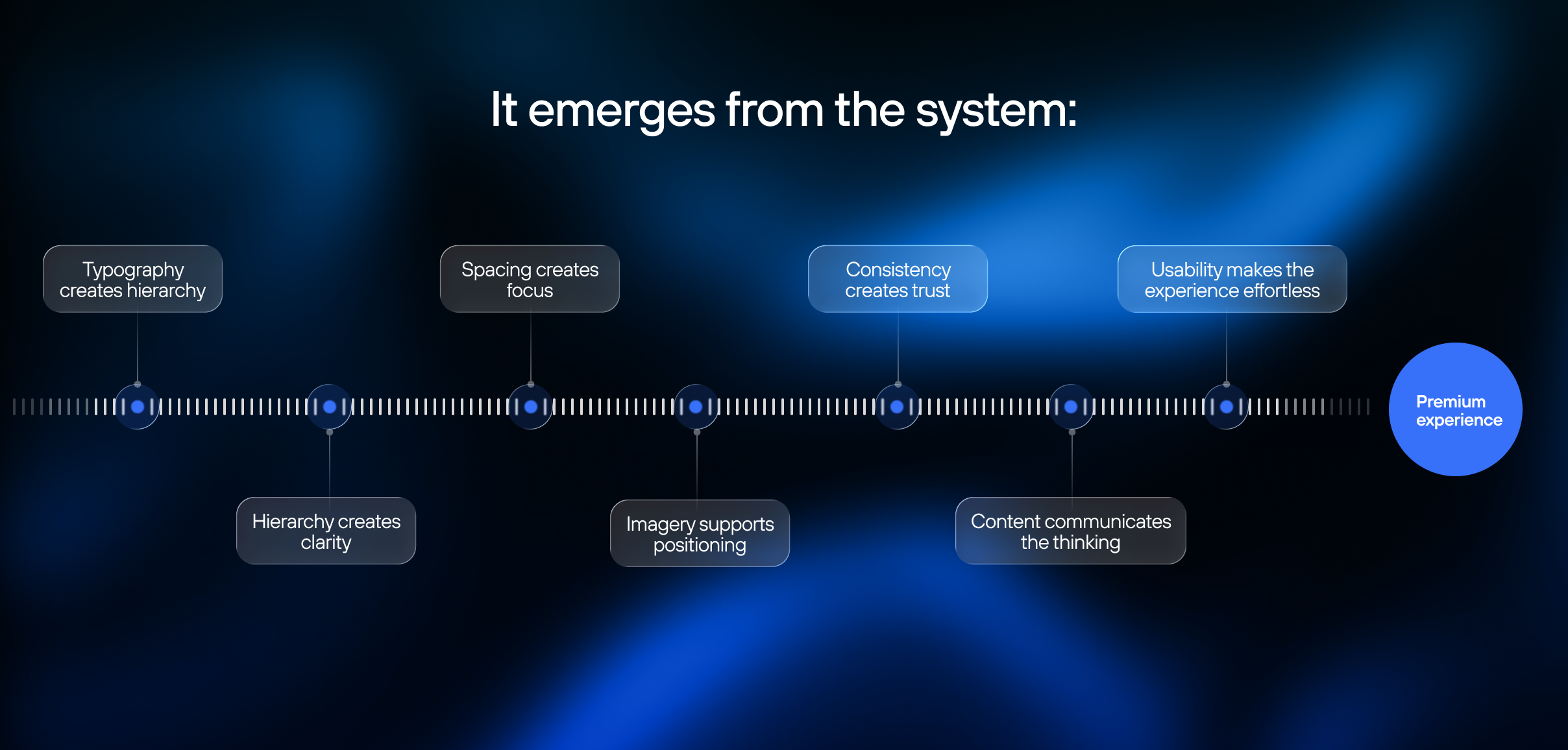
When these elements work together, the result doesn't necessarily look extravagant.
It feels considered. And that is often what makes a B2B website feel premium.
A premium B2B website is rarely the result of adding more design. It is the result of making better decisions — and making sure those decisions work together.
The typeface, the space around a heading, the image chosen for a section, the wording of a CTA, the structure of a page and the way a user moves through the site all contribute to the same experience.
None of these details needs to shout.
Together, they communicate something much more powerful: We thought this through.
That is what premium design should feel like.

If the first thing your website project produces is a Figma file, you may be starting too early.

A B2B website redesign is easy to think about as a design project.

A B2B website doesn't need a redesign just because it looks a little dated.

 Start a project